Dashboard para Facebook e Instagram: ¿sabes cómo preparar el tuyo?
Si trabajas en marketing digital, seguro que alguna vez has necesitado tener un dashboard para Facebook e Instagram, con todos los datos bien integrados y con información necesaria para tomar decisiones acertadas.
Porque si quieres saber qué publicación de Instagram funcionó mejor el mes pasado, qué día de la semana es el mejor para lanzar tus publicaciones o qué grupo de edad es el que mejor engagement tiene, lo más seguro es que tengas que buscar entre distintos gráficos del Business Manager de Facebook e Instagram. Además, será complejo cruzar determinadas métricas o responder a ciertas preguntas, más si gestionas varios perfiles o cuentas como es el caso de las agencias de performance marketing.
Tampoco hará falta perder demasiado tiempo preparando enormes cantidades de datos, tablas dinámicas ni trastear con pesados archivos Excel que con el tiempo nadie sabe dónde están.
La idea será tener un dashboard para nuestros perfiles de Facebook e Instagram en los que poder consultar la información más relevante, partiendo de un nivel más agregado hasta llegar a un grado de detalle mayor.
¿Necesitas más motivos para montar tu dashboard de Facebook e Instagram?
¿Cómo voy a transferir mis datos?
Como vamos a trabajar nuestro dashboard en una plataforma externa a Facebook e Instagram, necesitaremos tener los datos conectados en tiempo real y de manera permanente.
Si en tu equipo no cuentas con un perfil técnico capaz de conectar la API de Facebook con la plataforma de visualización, necesitarás recurrir a alguna de las soluciones comerciales que existen a día de hoy.
Hay múltiples opciones para conectar nuestros datos a nuestro dashboard, pero la alternativa que nos parece más interesante es Supermetrics. Tienen una licencia mensual a un precio asequible y con unos pocos clics tendremos la conexión realizada.
¿Con qué plataforma voy a crear el dashboard para Facebook e Instagram?
Una vez tenemos nuestro conector, podemos hablar de la herramienta de visualización, en nuestro caso: Google Data Studio.
Realmente deberíamos asegurarnos de la compatibilidad de la plataforma donde crearemos nuestro dashboard antes de elegir conector. Pero en este caso se trata de proveedores con una elevada distribución y uso en el mercado, por tanto, perfectamente compatibles.
En primer lugar, utilizaremos Data Studio porque es personalizable en un elevado grado. Es una herramienta relativamente nueva pero en constante mejora. La uso para diversas fuentes de datos desde hace más de una año y cada día aprendo algo nuevo e intento sacar el máximo partido, como comentaba en este post de Google Data Studio.
Se encuentra dentro de la suite de Google y es fácilmente compartible, por lo que resulta más sencilla la colaboración entre distintos equipos. Además es compatible con múltiples fuentes de datos, bien sea con conexión directa para todos los productos de Google (Google Ads, Google Analytics, Search Console, YouTube Analytics, Google Sheets, BigQuery, etc.) y para bases de datos (MySQL y PostgreSQL) o mediante un servicio de terceros que te conecta con las múltiples herramientas de marketing digital que existen. Con una cuenta de correo de Google podrás acceder a ella, su uso es gratuito.
¿Cómo conecto mis datos?
El uso de Google Data Studio es muy sencillo e intuitivo. Bastará con añadir a nuestras fuentes de datos la cuenta de Facebook e Instagram para la que vamos a crear el dashboard:

Y asociar ésta a un nuevo informe.

¿Cómo creo un gráfico?
Tenemos la opción de crear el dashboard desde la nueva fuente de datos. Pero también podemos vincular la fuente de datos después, a partir de un nuevo informe. Una vez tenemos esto, podemos comenzar a unir las distintas métricas y dimensiones para cada gráfico. Y como vemos, los tipos de gráficos que nos permite Data Studio para nuestro dashboard son bastante variados.

¿Qué gráficos voy a elaborar?
Como comentábamos anteriormente, nuestro dashboard de Facebook e Instagram debe ser nuestro punto de partida en nuestros análisis para luego poder tomar decisiones concretas. Y para ellos partiremos de un nivel más genérico de información y buscaremos luego un mayor grado de detalle.

Conoce a tu audiencia
Lo primero que tenemos que hacer, si no lo sabemos ya, es conocer a nuestra audiencia. De esta manera podremos personalizar nuestros contenidos y campañas. Y podremos extrapolar conocimiento sobre nuestros potenciales clientes.


La composición de estos perfiles no debería variar en exceso a lo largo de los meses, pero sí que puede ser interesante compararlos cuando hagamos un análisis con un poco más de perspectiva temporal y compararlos por si han cambiado a lo largo del tiempo y tratar de entender el porqué.
Por ejemplo, sería interesante comparar también si los fans de nuestra página son los mismos que el grupo que más interactúa con nuestra publicaciones. Y si se da el caso, podemos potenciar el contenido que más interesa a la gente que interactúa, por ejemplo. De la misma manera que podríamos tratar de captar la atención de los fans que menos interactúan con otro tipo de publicaciones.
¿Dónde está tu audiencia?
Con nuestro dashboard de Facebook e Instagram también podremos conocer la ubicación de nuestros seguidores. Y será tan interesante si se tiene presencia en múltiples países como si el ámbito es más local. Así, trataremos de identificar las diferencias geográficas para personalizar lo máximo posible nuestro contenido, buscando incrementar la interacción de los seguidores y, por tanto, fortalecer la relación con nuestra marca.


¿Qué tipo de mensaje?
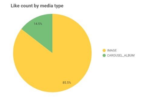
Este apartado tiene un componente bastante cualitativo, por lo que habrá que analizar las publicaciones en sí, por el tipo de contenido del que se trate. Aunque dentro de nuestro dashboard de Facebook e Instagram podemos incluir sencillos gráficos que nos den pistas sobre qué tipo de creatividad nos está aportando más likes, en este caso.
¿Cómo es el engagement?
En este punto la idea es detectar cómo es el engagement de nuestro contenido, conocer si se genera mediante comentarios, si es porque tiene muchas comparticiones, si se basa más en “Me gusta”, o es una combinación de estas 3 acciones.
Mediante nuestro dashboard de Facebook e Instagram también debemos averiguar qué tipo de contenido genera más engagement entre los seguidores pero también cuál se hace viral y porqué. De esta manera podremos potenciar aquel tipo de publicaciones que mejor respuesta genera y más visibilidad reporta a nuestra marca.

También será interesante ver en agregado cuál es el mejor momento para publicar, por ejemplo, por día de la semana.

¿Cómo evolucionan estas métricas?
Más arriba ya hemos visto algún gráfico con horizonte temporal, ya que, para algunas métricas de nuestro dashboard, el eje del tiempo cobra especial importancia.
Por ejemplo, en fases iniciales o en las que estemos probando distinto tipo de contenido, será clave analizar cómo evoluciona el engagement en el tiempo. Pero también lo tendremos que tener en cuenta si realizamos publicaciones periódicas o en base a un calendario editorial, para ver mensualmente las variaciones que se puedan producir en las distintas métricas.

Conclusiones
Como hemos visto, estos gráficos para nuestro dashboard de Facebook e Instagram son bastante sencillos y nos permitirán conocer mejor a nuestra audiencia. Podemos ver datos agregados que nos facilitan la creación de perfiles en base al género, la edad, la ubicación geográfica y los distintos tipos de interacción de nuestros fans y potenciales.
Para conseguir este análisis crearemos un dashboard en Data Studio para nuestros perfiles de Facebook e Instagram.
En base a este análisis, trataremos de personalizar nuestras publicaciones y contenido para que haya la máxima afinidad con nuestro público objetivo y mejore la respuesta y visibilidad de nuestra marca.
¿Habías creado ya tu dashboard para Facebook e Instagram? ¿Incluirías alguna métrica más en este tipo de dashboard?