Cómo crear un Diseño de Landing Pages orientado a Conversiones
Ya llevamos años oyendo hablar de User Experience, usabilidad, accesibilidad… Muchas normas, tendencias y consejos que podemos seguir cuando nos enfrentamos al diseño de una landing page o website. Pero al diseñar una Landing Page, con un objetivo tan claro e importante como es la consecución de leads, hemos de tener en cuenta algunos puntos clave. Porque cuando diseñamos una Landing Page y los resultados (medibles, ¡comparables!) no son favorables, significa que algo hemos hecho mal…
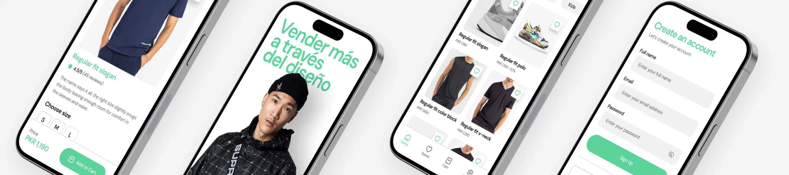
1. El objetivo es la conversión. Céntrate en ese objetivo
El éxito de una landing page se puede medir directamente con números. Si tus analíticas no devuelven resultados favorables la Landing Page no está siendo de éxito. Y aunque existen muchos factores que pueden perjudicar la tasa de conversión, seguro que el diseño de la Landing Page tiene mucho que ver.
¿Qué significa que el objetivo es la conversión?
Cuando diseñamos una web corporativa o un microsite promocional, el objetivo principal puede ser el branding (“hacer marca” dice la gente de marketing), la visibilidad o el impacto visual, entre otros. Sin embargo, cuando diseñamos una Landing Page, el objetivo es la conversión, generalmente a través de un formulario.
Si el diseño de la Landing Page no se dirige a ese objetivo, entonces, ese diseño es erróneo. Ya no basta con cumplir las normas básicas del diseño web. Ahora, además, has de centrar tus esfuerzos en que el usuario rellene un formulario y haga click en un botón. Ese botón es, desde el momento en que empiezas a hacer el wireframe, tu Vaca Sagrada. Los clicks en ese botón son tu forma de demostrar que tu diseño es válido.
Por eso en Digital Menta decimos que lo que no se mide, no se puede mejorar. Porque un diseño de Landing Page que genera más conversiones que otro (para la misma campaña, el mismo producto, misma inversión,…) es, definitivamente, mejor.
Diseño de Botón en la Landing Page, la Vaca Sagrada
2. Atrae la atención del usuario a los puntos clave de la Landing Page
Es un principio fundamental del diseño (tanto gráfico, como web). Igual que cuando diseñas un cartel, has de focalizar la vista del usuario/lector/mirón hacia la información importante y jerarquizar todos los mensajes que ofrezca tu diseño.
Los expertos dan algunas claves para ello:
- Juega con los espacios en blanco. Favorecen una lectura relajada y permiten destacar y jerarquizar la información. Ya no vale aquello de “que se vea todo sin hacer scroll”.
- Crea un recorrido visual. Lleva al usuario del Hero Shot al titular principal, de ahí al primer párrafo y de ahí al formulario. Utiliza flechas si lo ves necesario (¡ojo! Hay que ser sutil, no “obligues” al usuario o se enfadará y se irá con mala cara…)
- El “Call to action”. Ese botón sagrado. Ese que sumará +1 en nuestro éxito. Cuídalo, dale toda tu atención. Repasa todo lo que aprendiste sobre la psicología del color cuando estudiabas, porque es nuestra llave al éxito. Crea un mensaje atractivo y explícito para él (“Enviar” no le resulta atractivo a nadie pero, “Enviar este formulario y recibir entradas para un concierto a cambio” ya es otra cosa. Yo haría click mucho más convencido, ¿tu no?)
- Utiliza los colores en tu favor, para no provocar estrés en el usuario, para jerarquizar la información, para destacar tu Call to action…
¡Haz lo que sea para que al usuario de tu Landing Page le entren ganas de hacer click!
3. Conecta directamente con tu público objetivo. Haz que se identifiquen con tu mensaje.
Es cuestión de lógica. Pero si lo pierdes de vista, vas a perder leads.
Hay 3 elementos clave con los que has de conseguir captar la atención y la emoción del usuario:
El “Hero Shot”
Es la representación visual (una imagen, un vídeo…) de lo que ofrece tu Landing Page. Si está, es el elemento principal de la Landing, lo primero que verá el usuario. Y, por eso, tenemos que emocionar al usuario, conseguir que se identifique instantáneamente y que sienta que está en su entorno, que sienta que es algo a lo que aspira. Si nuestra Landing trata de captar interesados en un curso para bomberos, ¡fácil! pon a un intrépido bombero. Y si vas a ofrecer inversiones en energía solar, haz que el usuario se sienta relajado y que vea un reconfortante sol, como hicimos en este caso de éxito.
Diseño del Hero Shot en una Landing Page
El “Headline”
Esto es cosa de un copy, pero no está de más tener presente que ha de ser atractivo, directo y que debe dejar absolutamente claro el asunto de la landing page. Que sea legible, muy legible. Y visible, muy visible.
El “Call To Action”
Te lo llevo diciendo un rato, es nuestra vaca sagrada. Es lo que significa el éxito de nuestra Landing Page. Estudia su color, su tamaño, su ubicación y su mensaje. Y haz que se convierta en el destino final e ineludible del recorrido visual que has preparado.
4. KISS (Keep It Short and Simple). Y habla a tus usuarios para que te entiendan.
Diseño Simple and Short de Landing Page
Seguro que puedes resumir la parrafada que te ha pasado el cliente en una infografía que multiplicará por 1000 el placer de visitar tu Landing Page.
¿Por qué cuidamos tanto la posición del formulario, su visibilidad y la relevancia del Call to action? Porque es el objetivo para el que construimos la Landing Page (la conversión como religión) y un formulario se rellena “en caliente”. Has de emocionar al usuario para captar su atención y su interés. Un montón de texto sólo invitará al usuario a hacer clic en el botón de “Atrás”.
Alguien inventó el término UX para algo. No hay que olvidarlo nunca.
Casi (repito, casi) tan importante como el Call to Action son los titulares (headlines) de la Landing Page.
Aunque esto no es asunto del diseñador, tu y yo sabemos que has de ser un poco todoterreno.
5. Haz un seguimiento de los resultados de tu diseño y actúa en consecuencia
Una Landing Page formará parte de una campaña (ya sea de AdWords, de redes sociales o una acción en supermercado). Durante el tiempo que dure la campaña, si es lo suficientemente largo, podrás detectar y corregir los fallos que cometiste en la propuesta inicial revisando los resultados que te reporte la gente de marketing (o tu mismo, amigo todoterreno).
Si te encuentras con una tasa de conversión muy baja, es el momento de actuar. ¿Puede ser que el formulario tenga demasiados campos? ¿Y si el hero shot no logra emocionar ni captar la atención? Haz tests de usuario (en esta web, por ejemplo). Y, por supuesto, valora la posibilidad de llevar a cabo un TEST A/B. ¿Sabes de que va?
Esperamos que estas claves os sirvan para optimizar vuestras Landing Pages. En un próximo artículo hablaremos más detenidamente sobre los elementos clave que tiene que tener una Landing Page perfecta, esos que sí o sí tiene que estar ¡Hasta la próxima!