¿Puede un buen diseño web aumentar la tasa de conversión? La respuesta es sí.
El diseño web UX/UI (experiencia de usuario e interfaz de usuario) ha cobrado una gran relevancia en los últimos años. Con páginas (landings) claramente orientadas a objetivos y aumentar la tasa de conversión, cada decisión tomada en el proceso de diseño puede ser decisiva a la hora de llevar al usuario a buen puerto.
En muchas ocasiones, una landing con un diseño mal resuelto obtiene malos resultados y puede dar al traste con un trabajo previo inmaculado. La estrategia era buena, tus campañas estaban bien configuradas y los usuarios llegan a tu página, sin embargo, la tasa de conversión está por los suelos. ¿Te suena? Resulta frustrante contemplar cómo tus usuarios abandonan tu página con la misma velocidad con la que entraron. A continuación, exponemos 8 claves para diseñar una landing orientada a la conversión.
Tips para aumentar la tasa de conversión
Un solo propósito, una sola llamada a la acción (Call to Action)
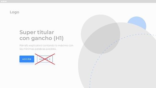
Una landing debe tener un solo objetivo y un solo CTA. Al fin y al cabo, diseñar una landing es trazar un camino que lleva al usuario desde el punto A (entrada a la página) al punto B (realizar la acción que esperamos de él). Cuantas más opciones des a tus usuarios más lejos estarán de la ansiada conversión.
Elige bien los colores
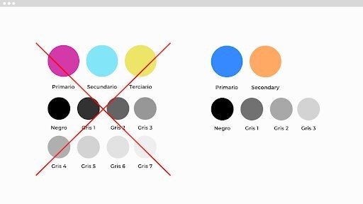
El color forma una parte muy importante de la narrativa visual, no puedes descuidarlo. Utiliza una gama de colores no demasiado extensa. Un color primario, que podremos utilizar de acento o como color paras las acciones. Un color secundario, que esté bien contrastado respecto al primario, y unos pocos grises deberían bastar.
Diseña un CTA que invite a ser clicado
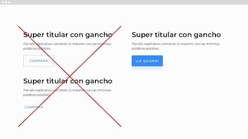
Elige un sitio destacado para tu CTA dentro de tu composición. Un tamaño que facilite la pulsación del mismo. Un color apropiado; si elegiste un buen color primario para el tema de color de tu página, ¡Ya lo tienes hecho! Procura que el texto sea claro y legible. Evita términos imperativos, utiliza frases más emocionales. Usar sombras ligeras también pueden ayudar a destacar tu botón.
Utiliza cabeceras (headings) bien contrastadas
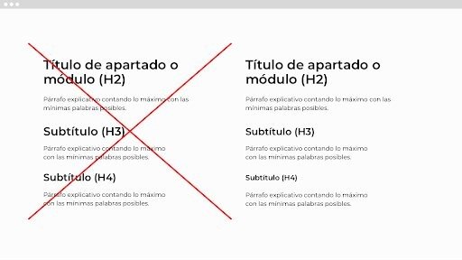
El tamaño de las cabeceras establece una jerarquía visual que permite a tu usuario distinguir las partes importantes de las que lo son un poco menos. Unos headings mal contrastados, es decir, con tamaños parecidos, pueden hacer que el usuario no perciba con claridad la jerarquía entre los diferentes apartados de tu página. La diferencia entre tu H1, H2, H3 y H4 debe apreciarse a simple vista.
Diseña con la máxima limpieza posible
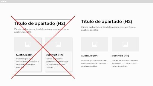
Elimina todos los elementos innecesarios, siempre es más fácil perderse en la selva que en la sabana. Intenta encontrar soluciones funcionales y evita la cosmética. Recargar una página de elementos visuales no la hace más atractiva y, por supuesto, no ayuda a hacer que tu contenido sea más comprensible, más bien todo lo contrario.
Cuida los espacios en blanco
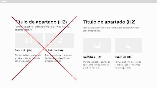
Los espacios en blanco entre los elementos también forman parte de la composición de la página, estructuran y ayudan a jerarquizar el contenido. Si utilizas espacios pequeños tu página lucirá abigarrada, los elementos de tu diseño estarán muy juntos y será más difícil distinguirlos. Y si utilizas espacios demasiado grandes tu información parecerá inconexa y será más difícil establecer una relación entre los diferentes elementos.
Usa imágenes potentes
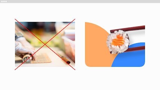
La imágenes de una landing no solo deben ayudar a explicar el contenido, además, deben seducir. Utiliza imágenes que apelen a las emociones de tus usuarios, con encuadres atrevidos y colores vivos. Se original, al ojo le encanta lo diferente. Pero no olvides que los colores de tus imágenes guarden una relación armónica con la gama de colores de tu landing.
Mima todas las versiones de tu landing (responsive)
No se navega igual en un teléfono que en un ordenador de sobremesa o una tablet. Adapta tu contenido al dispositivo en cuestión. Cuida todas las versiones de tu landing, especialmente la versión mobile, y procura que todos los puntos expuestos anteriormente se cumplan en cada versión.
¿Aún no estás seguro de como explotar el diseño de tu web? ¡Contáctanos!