
Claves para optimización de formularios en landing pages
Ya lo hemos dicho en otros artículos, en una landing page para lead generation, el call-to-action (la llamada a la acción, el botón) es nuestra “vaca sagrada” y clave para la optimización de formularios. Cuando el objetivo de conversión es rellenar un formulario (y enviarlo, que para eso sirve nuestro botón sagrado), desde el primer mockup de la landing page debe estar enfocado a conseguir que el usuario cumplimente los campos -voluntariamente, olvídemonos de Dark Patterns– y se interese por nuestra propuesta de valor.
En una estrategia de optimización de la conversión para una landing page de lead generation, el formulario va a ser una parte fundamental del análisis y de la fase de testeo. Además de value propositions, fotos, vídeos, layout… En este post queremos hablar de algo que nos gusta mucho y nos da muchos quebraderos de cabeza: optimización de formularios.
Primero, vamos a identificar los componentes fundamentales que debemos analizar en un formulario:
Factores para la optimización de formularios en landing page
1- Posición del formulario
Desde el primer mockup de una landing page, esta es una decisión fundamental para la optimización de formularios: ¿Dónde situamos el formulario? Dos opciones básicas: above the fold o below the fold. Una landing page tiene un “story telling”, un guión que nos cuenta algo en el orden adecuado para convencernos. Y en algún momento, siguiendo la secuencia motivada de Monroe, tenemos que ofrecer al usuario la posibilidad de mostrar interés y rellenar el formulario. Depende de cómo sea el guión de nuestra página y, además, de cómo hayamos definido a nuestro buyer persona.
Si esperamos de nuestro usuario que tenga una actitud impulsiva problablemente nos favorezca situar el formulario “above the fold”, justo al lado de una proposición de valor potente. Si, por contra, es un usuario analítico (probablemente porque nuestra oferta requiera de un análisis más profundo), puede ser beneficioso situar un formulario al final de la página, después de haber mostrado todas nuestras armas.
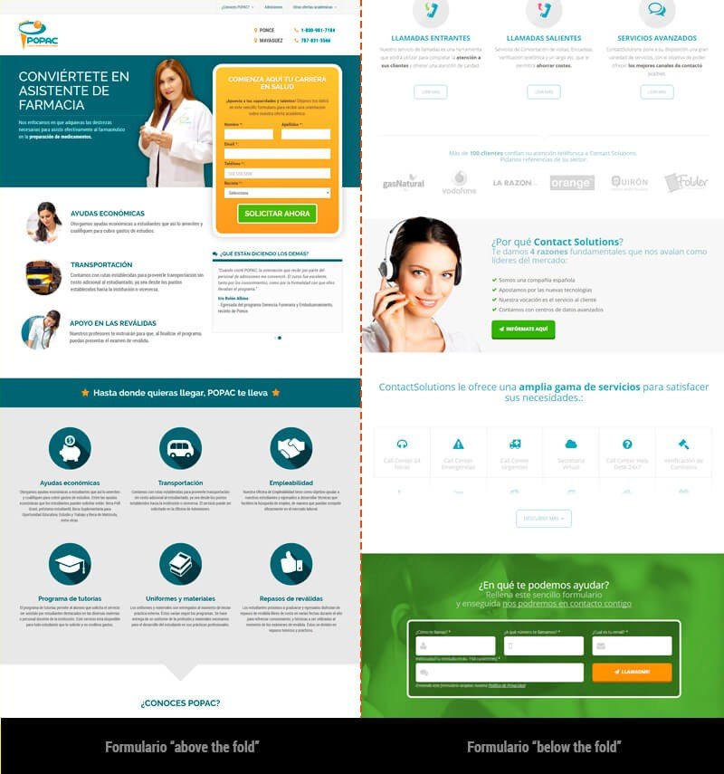
Ejemplos de formularios above/below the fold
Otra opción, adecuada para otro tipo de buyer, es lanzar el formulario en un lightbox accionado por un call to action. Es decir, dividir la conversión en 2 micro-conversiones: la primera es hacer click en un botón que nos muestra el formulario y la segunda es rellenar el formulario. Seguro que hay alguien que pone el grito en el cielo maldiciendo ese “click extra” que le añadimos al proceso, pero hay veces en las que el proceso de persuasión y convencimiento del usuario tiene diferentes matices. Y, como refuerzo de este argumento, podemos estudiar el efecto Zeigarnik, que nos propone que el usuario es más proclive a terminar una tarea si ésta ya está empezada. Conseguimos hacer el proceso de conversión menos agresivo y esto puede ser beneficioso para ciertos objetivos.
2- Call to action
El botón del formulario, la llamada a la acción, el click definitivo, el éxito de la campaña… Es un elemento muy susceptible de ser testeado para conseguir la optimización de formularios. Es increíble cómo puede afectar a la tasa de conversión el color, la forma, la funcionalidad y el mensaje de este botón.
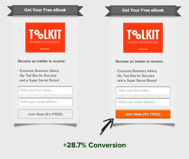
A/B Test sobre Call to action [fuente: http://optinmonster.com]
En este aspecto podemos hablar de psicología del color, UX (animaciones, tamaño, forma,…), neuromarketing, copywritting,… Nos daría para 5 artículos. Nos limitaremos a mencionar, de forma básica, características importantes que hemos de tener en cuenta en el diseño del botón de un formulario:
- Contraste
- Usabilidad: fácil de clickar, visible e interactivo (¿Hace algo cuando pasamos el ratón por encima?)
- Claridad: ¿Sabes qué hace este botón?
3- Número de campos. Longitud del formulario.
Empiezas en el marketing online, diseñas las primeras landing pages para campañas de SEM, aplicas tus conocimientos de usabilidad y lo primero que haces es luchar por reducir el número de campos del formulario. Te convences a ti mismo de que, cuantos menos campos tuviera el formulario, más alta sería la tasa de conversión. Puede ser. Pero también podríamos decir que si redujeramos el precio de nuestro producto a la mitad, venderíamos más. Y ahí es donde la discusión pasa al siguiente nivel.
Nos ha pasado muchas veces en Digital Menta. Eliminamos campos de un formulario, aumenta la tasa de conversión pero baja la calidad de los leads. Entonces el equipo de ventas del anunciante pierde tiempo con contactos no válidos, confundidos o simplemente poco interesados. Y, además, el proceso de venta se hace más largo. El anunciante tiene más conversiones pero ha bajado su ROI. Así que, en casos como éste, la optimización del formulario pasaría por ajustar el número de campos que permita el equilibrio entre la tasa de conversión, la calidad de los leads y la inversión.
De todas formas, cuando el formulario es largo por necesidad (un registro con datos personales, datos de envío, datos de pago…), una opción para optimizarlo es diseñar un Multi-step form. Dividimos el proceso de registro en diferentes pasos para crear cierta dinamización y poder captar micro conversiones. Recordemos el efecto Zeigarnik. Un ejemplo simplificado:
-
- Un usuario empieza el proceso de registro en nuestra plataforma. En el primer paso nos da su nombre y su email.
-
- En el segundo paso nos da sus datos personales (solo los obligatorios): fecha de nacimiento y país de residencia.
- En el tercer paso, abandona.
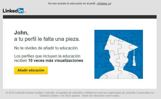
- Al cabo de cierto tiempo (1 día, 1 semana,… depende de lo “insistentes” que queramos ser), le envíamos un mail sugiriéndole que termine su proceso de registro. ¡Sólo le queda el 50% del proceso!
El email que envía Linkedin después de una microconversión
4- Usabilidad en los formularios
Este punto no sólo aplica a la optimización de formularios en landing pages, sino a cualquier formulario: login de usuarios, checkout de un ecommerce,…
Se podrían escribir enciclopedias enteras sobre usabilidad en formularios online. Nos gustaría dedicarle un post exclusivamente a este tema, así que vamos a dejarlo en un resumen.
Diseñar y desarrollar un formulario online tiene mucho en común con diseñar, por ejemplo, una lavadora. Si no me hacen falta unas instrucciones para entender cómo funciona, no tengo que adivinar si lo estoy haciendo bien, el botón de arranque no está escondido, es legible… Ergonomía aplicada al diseño web, precioso.
A continuación, algunas buenas prácticas en el diseño y optmización de formularios:
-
- Haz la validación de los campos en tiempo real. La frustación que crea un mensaje de error al enviar un formulario provoca tasas de rebote indeseadas.
-
- Valida los campos “inline”. No muestres los errores lejos de cada campo. ¿El e-mail no es válido? Díselo junto al campo de email, no junto al botón de enviar.
-
- Ofrece opciones “default”. Por ejemplo, cuándo preguntas “Dónde nos conociste”, deja una opción preseleccionada. Así el usuario podrá saltar ese campo si coincide con su respuesta. O, si es un formulario de reserva, haz que la fecha de inicio sea la de hoy por defecto.
- ¡Mucho cuidado con las etiquetas asociadas a los campos! A veces, para ahorrar espacio, eliminamos el “label” y dejamos exclusivamente un placeholder dentro del campo. Si perdemos de vista este placeholder, si el navegador no lo muestra… El usuario no sabe que tiene que poner en ese campo.
-
- En móviles, este tema de labels es mucho más crítico. ¡Cuidado!
-
- El diseño de formularios para móviles es un mundo aparte. Una práctica muy aconsejable es tratar de sacar partido de los recursos nativos del teléfono: calendario, teclado numérico,…
Ahí van algunos ejemplos de optimización de formularios que han hecho que den ganas de rellenar:

Formulario de login de Deezer
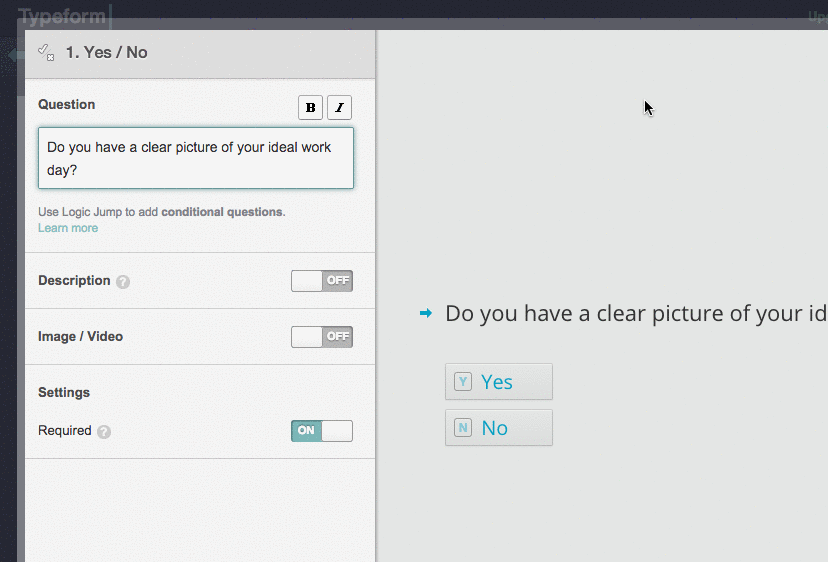
Typeform y la usabilidad de sus formularios [fuente: http://www.londonacademyofit.co.uk/learning-blog]

Investigación de usabilidad en formularios [fuente: https://dribbble.com/JamesSLock]